Ananta Ananta Ananta Ananta Ananta Ananta
"With its recognized status as a leading jewelry and diamond brand, ANANTA JEWELRY takes a monumental step in its three-decade-long history with the decision to redesign the business's identity and retail space. Transitioning from a fine jewelry business to a lifestyle jewelry brand, ANANTA has expanded its product offerings to meet a comprehensive range of demands, catering to clients of all age groups, tastes, behaviors, and budgets. More importantly, the new brand identity aims to introduce a fresh perception and value, making diamond and colored gemstone jewelry more accessible, wearable, and a part of everyone’s memorable moments in life, while maintaining the brand’s superlative standard.
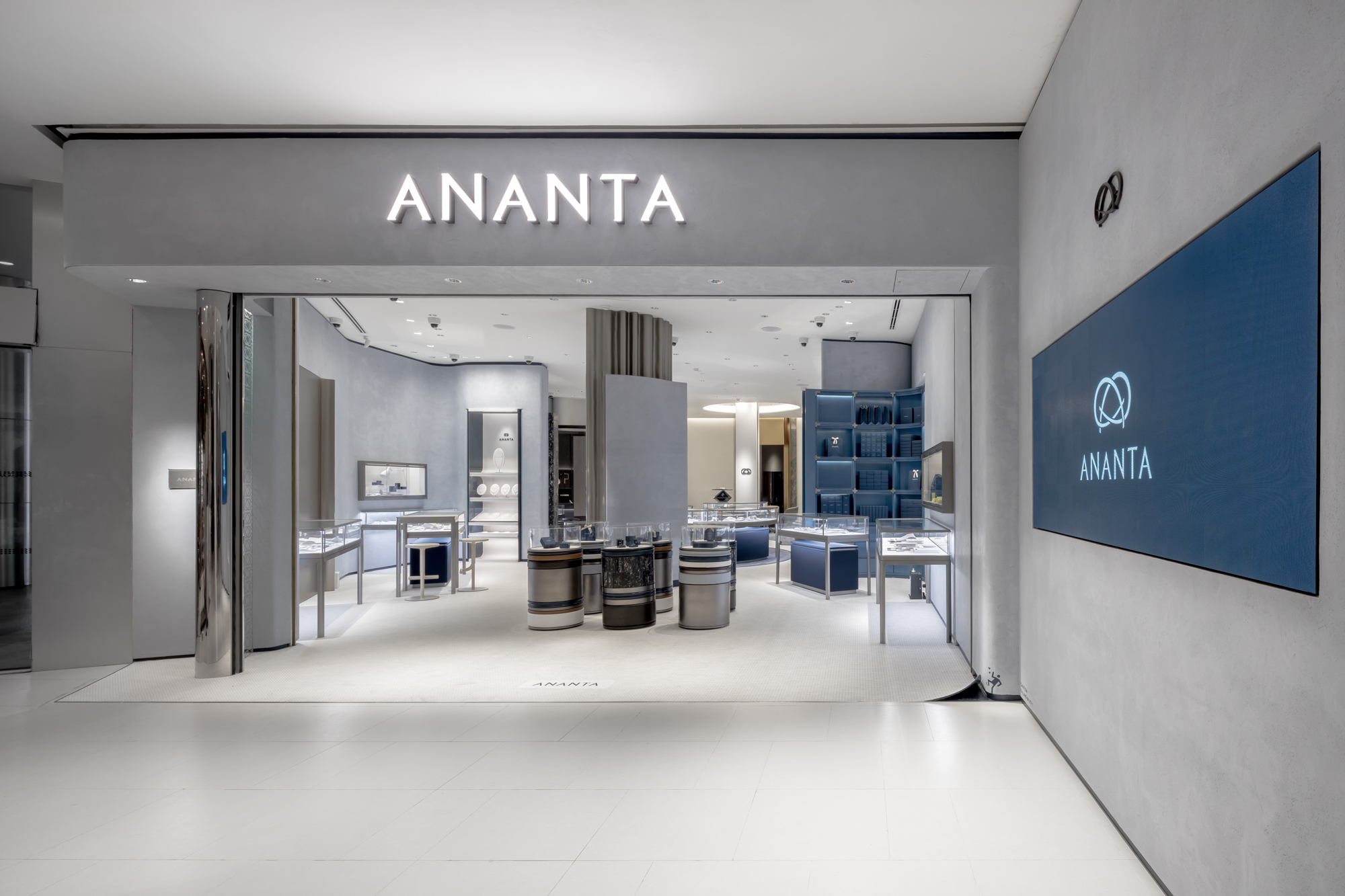
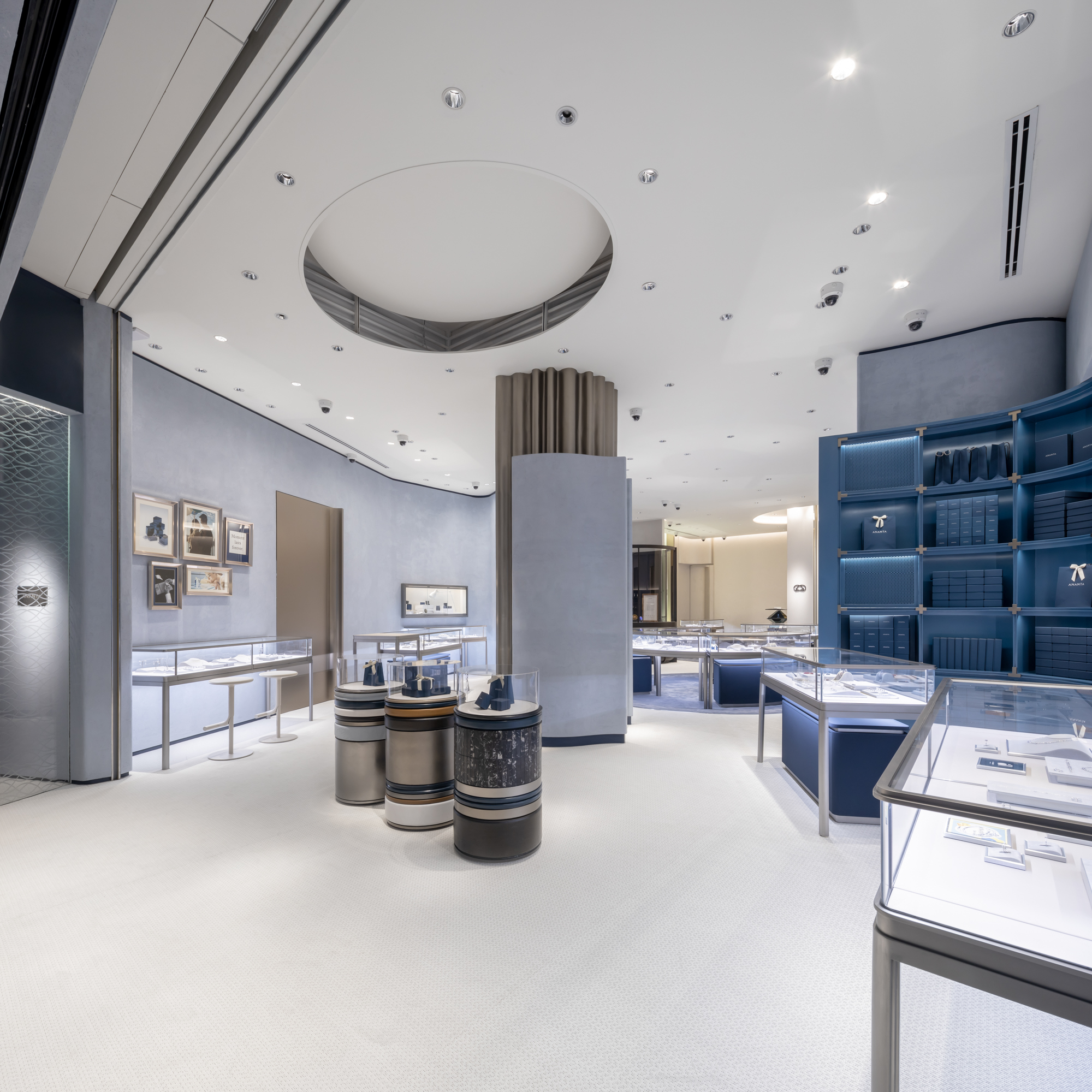
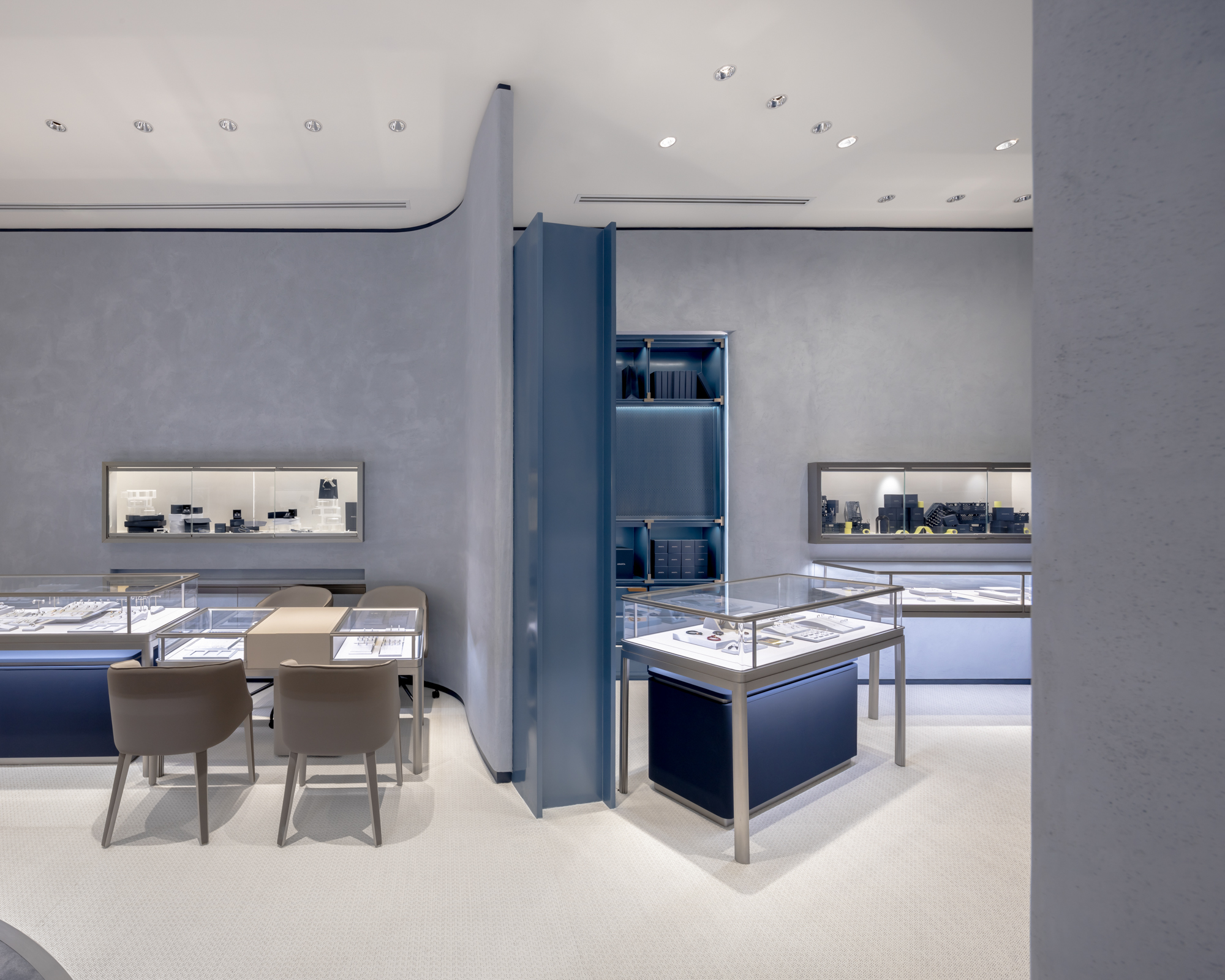
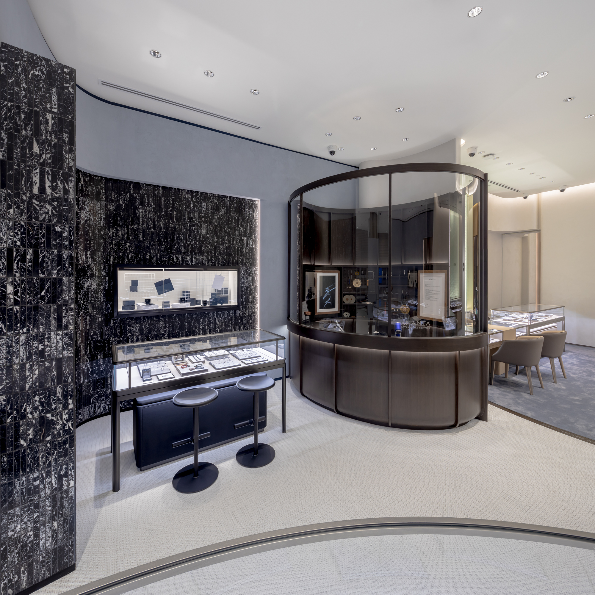
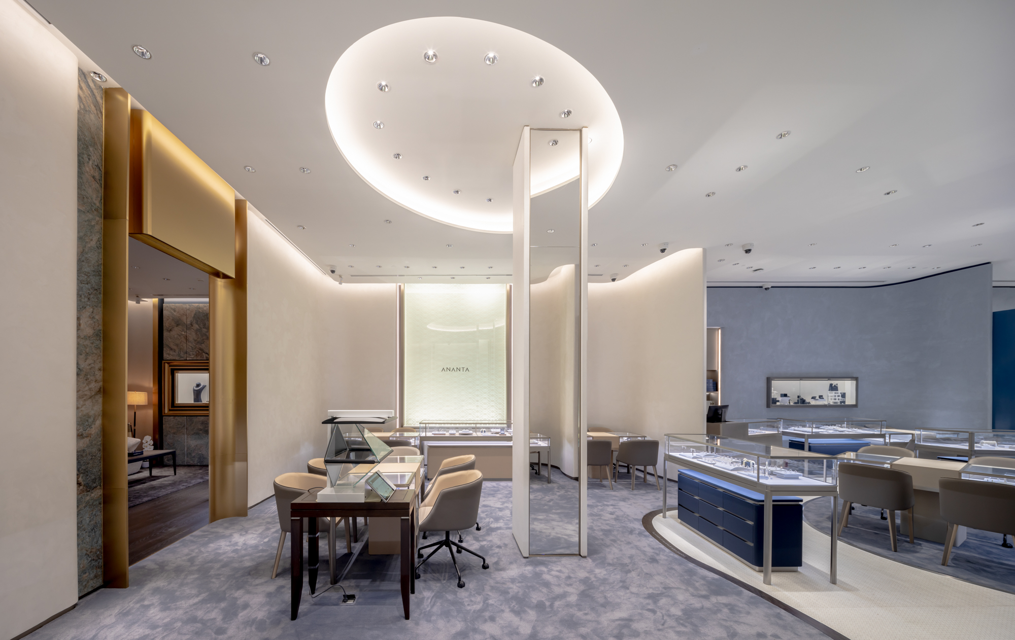
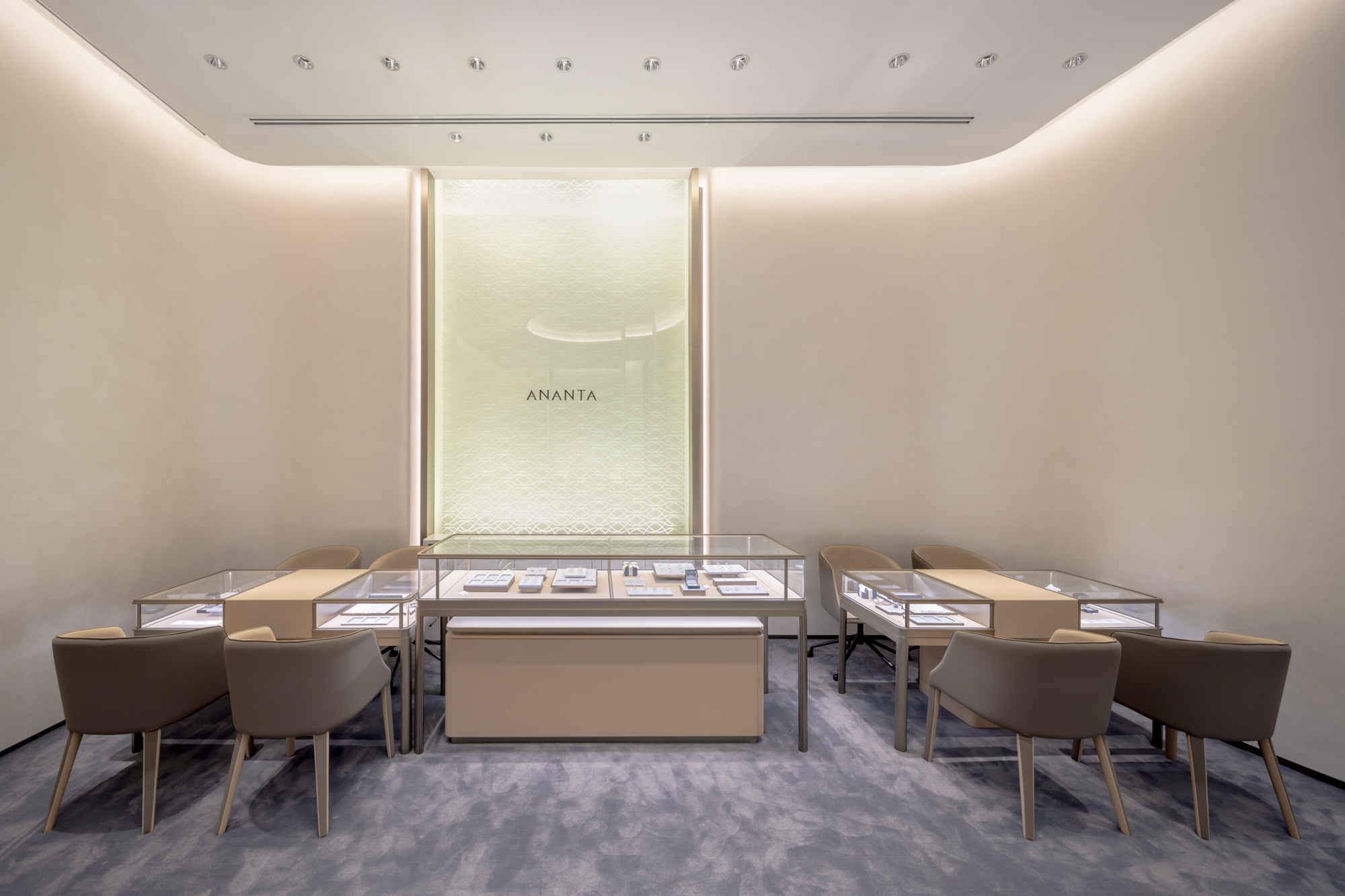
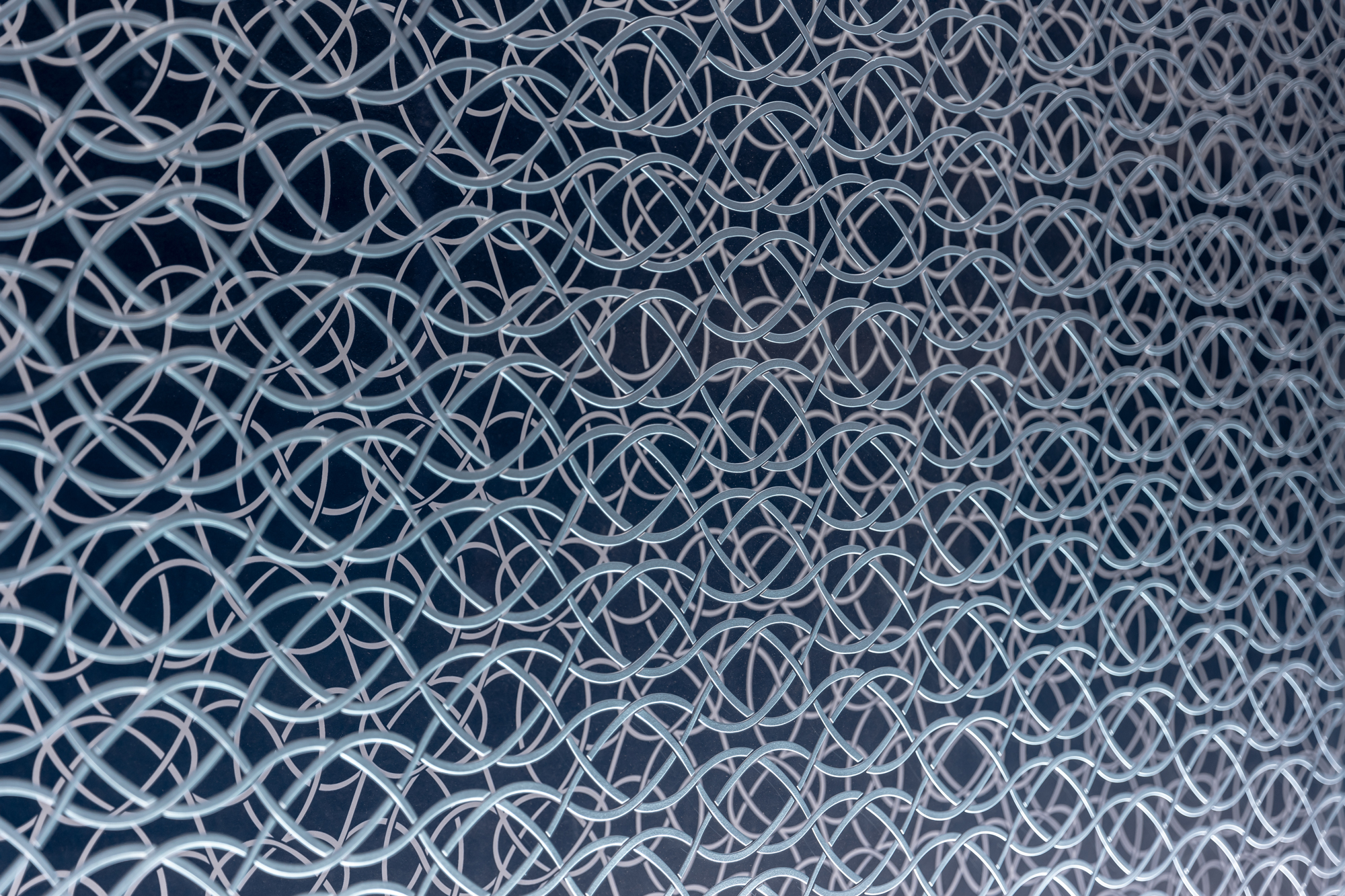
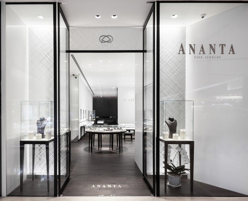
For this rebranding, IF is in charge of the interior design and environmental graphics, all of which are based on the conceptual definition of the name ‘ANANTA’ and its meaning of ‘eternity’ in Sanskrit. There is a connection between the name’s literal denotation and the intertwined lines of the brand’s infinity logo. IF develops the interior floor plan from the symbol’s distinctive curved lines, delivering a continual flow in the space, including the folded and deviated curved walls that define the shop's functional corners.
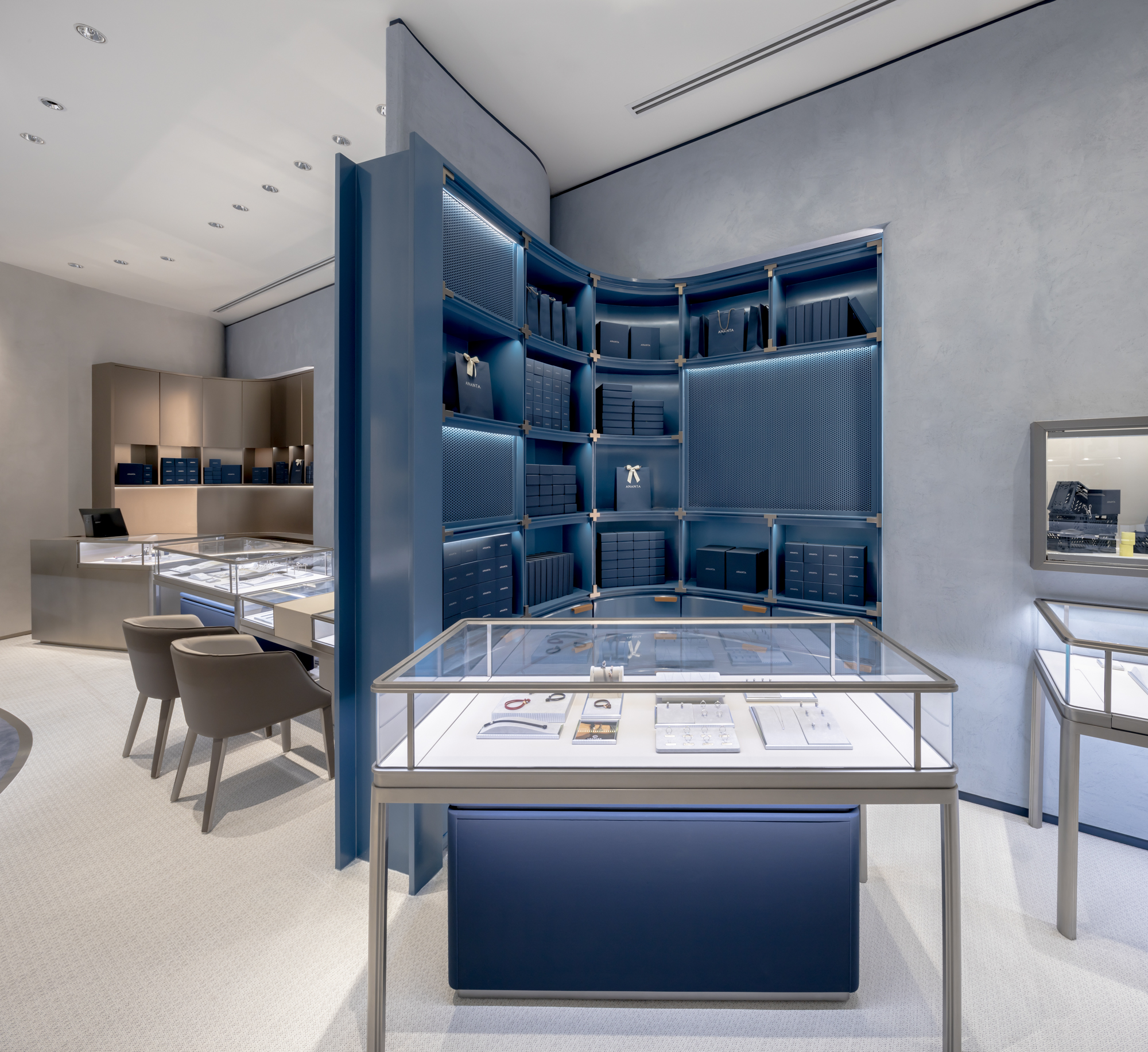
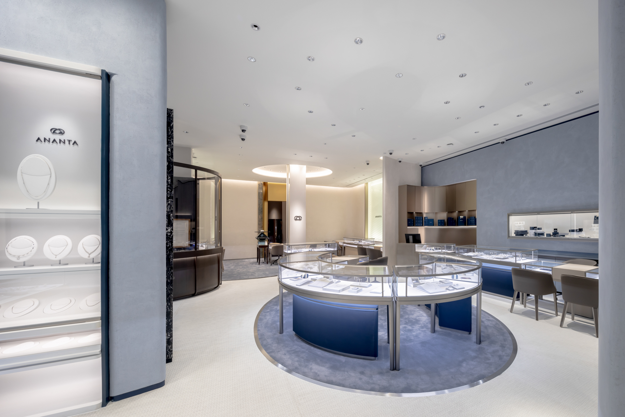
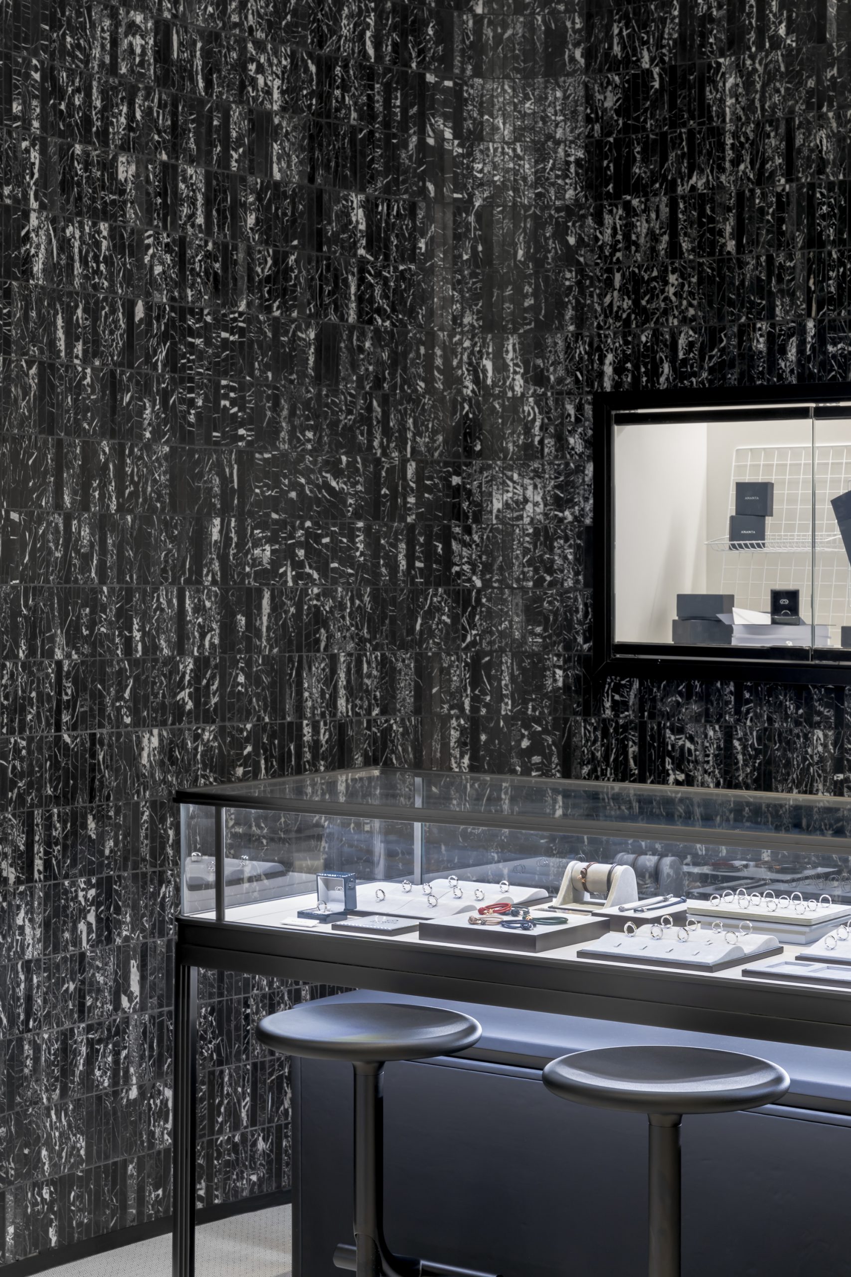
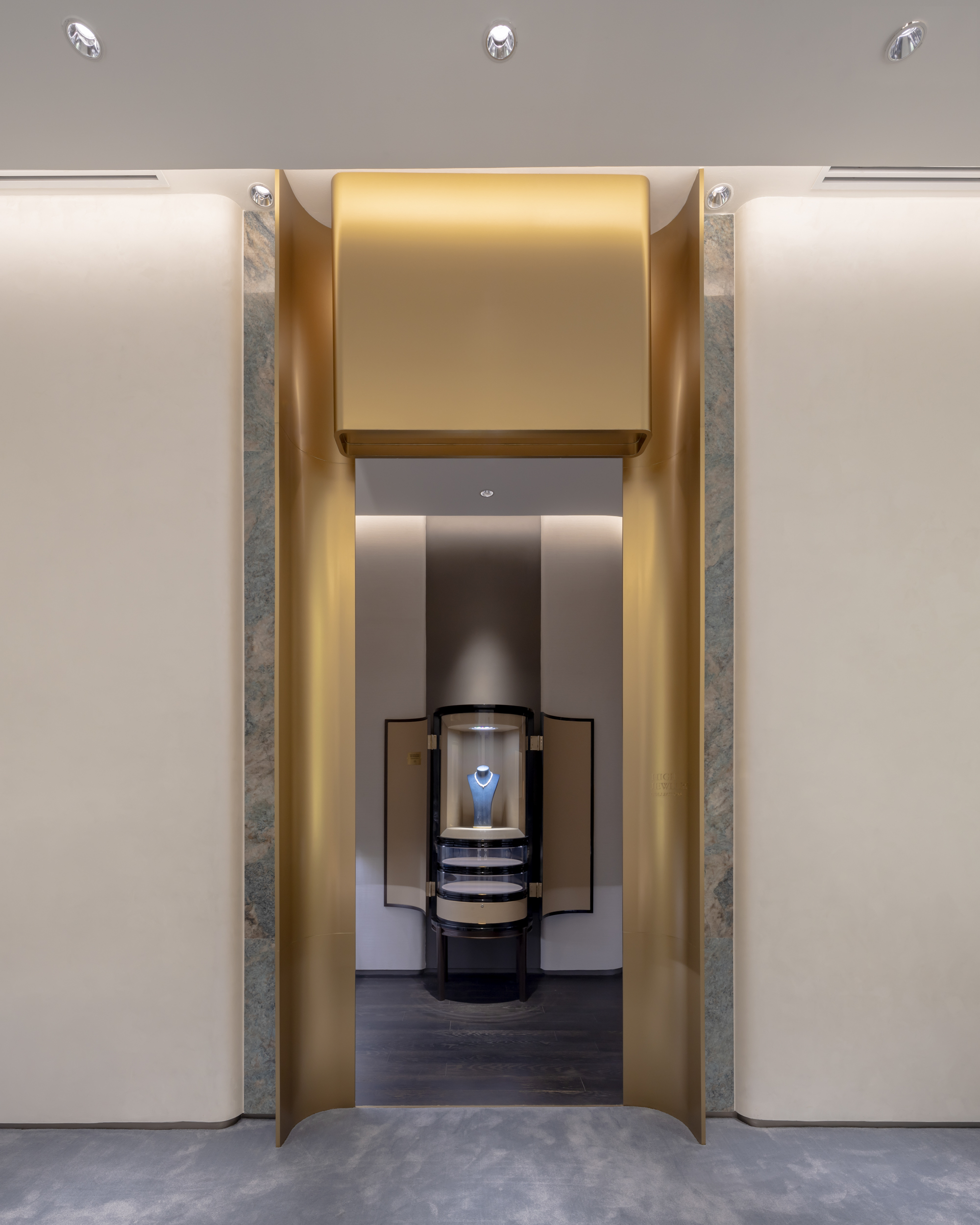
The design divides the interior into three sections. The ‘Lifestyle’ portion of the floor plan occupies approximately 70% of the space. To showcase the brand’s lifestyle jewelry line, IF blends luxury with an upbeat spirit and playful touches, making the area feel more accessible and less intimidating. The owner can adjust the decoration to keep the space and user experience fresh and exciting. Also within this zone is the ‘Men’s’ section, displaying pieces designed for male clients. The area’s decor embraces simplicity by using materials in darker colors such as black and navy blue, with white providing a beautiful contrast to the overall mood. The ‘Moment’ zone showcases lifestyle jewelry products in customized styles and price ranges, embodying both fun and elegance. The last area, ‘Bridal,’ focuses on wedding rings and conveys a feminine, dreamy, and vivacious spirit. The ‘High Jewelry’ zone, featuring the products from which the ANANTA brand originated, remains sophisticated but is now friendlier and warmer.
The interior space and environmental graphic design use a color palette that corresponds with the brand’s original and new corporate colors. From the front, the shop’s overall mood looks livelier, thanks to the presence of blue and navy blue. Brown, the brand’s original corporate color, is used in combination with white and other decorative elements like furniture.
To create a more accessible image for the brand, the design team uses colors and materials that set ANANTA apart from other similar establishments. The raw yet smooth wall surfaces make the space feel less formal, while the new open-plan layout—removing glass partitions and doors—enhances the sense of openness, contributing to ANANTA’s more welcoming, accessible, and friendlier retail space and brand image."
Location
Central World, Bangkok, Thailand
ClientsANANTA
Gross Floor Area197 Sq.m.
Design Date2019
Completion Date2020
Interior DesignerIF (Integrated Field)
Lighting DesignerFOS Lighting Design
Environmental graphicIF (Integrated Field)
Brand Identity Designerbe>our>friend
PhotographerKetsiree Wongwan